
Farmacy: Transforming Agriculture with Innovation
Designed a smart farming assistant that helps users track fields, forecast profits, and manage farm expenses — all in one seamless, data-driven experience.

Understanding the Product
Designed Farmacy to empower farmers with real-time field insights, AI-powered crop forecasting, and streamlined expense tracking. The platform combines drone scans, weather predictions, and financial tools to help farmers make data-backed decisions, improve yields, and manage budgets with ease.
My Team
Raghunath Rajasekar
Mihir Sharma (Me)
01/05
“Wait... which one’s my land again?” 🗺️
Too many farmers rely on gut feeling or neighbor gossip to decide what to grow — often leading to mismatched crops, poor yields, or market saturation. To change that, I built a smart crop recommendation engine that considers soil type, weather forecasts, past harvest data, and local market trends. The app then suggests the best crops for each field — complete with visuals, yield potential, and estimated profit. It’s like having a personal agronomist in your pocket.
I designed this screen to keep things simple and field-friendly — map on one side for drawing plots with tools like Draw, Shape, and Circle, and a neat 3×3 telemetry grid on the other for quick drone stats. Icon-text combos make info easy to scan, the dark theme saves eyes in the sun, and the bold orange CTA makes the next move a no-brainer.

02/05
“What should I plant this season?” 🌱
Farmers weren’t sure where to tap, what field they were looking at, or how to zoom in without getting lost in a sea of green. The map felt more like a maze than a tool. To fix that, I designed a clean, zoom-friendly land selection screen with crystal-clear field boundaries, satellite overlays, and simple tap-to-tag interactions. It’s like giving farmers Google Maps, but made just for their crops. No clutter. No confusion. Just one smooth scroll and tap — and boom, your farm’s ready for action.
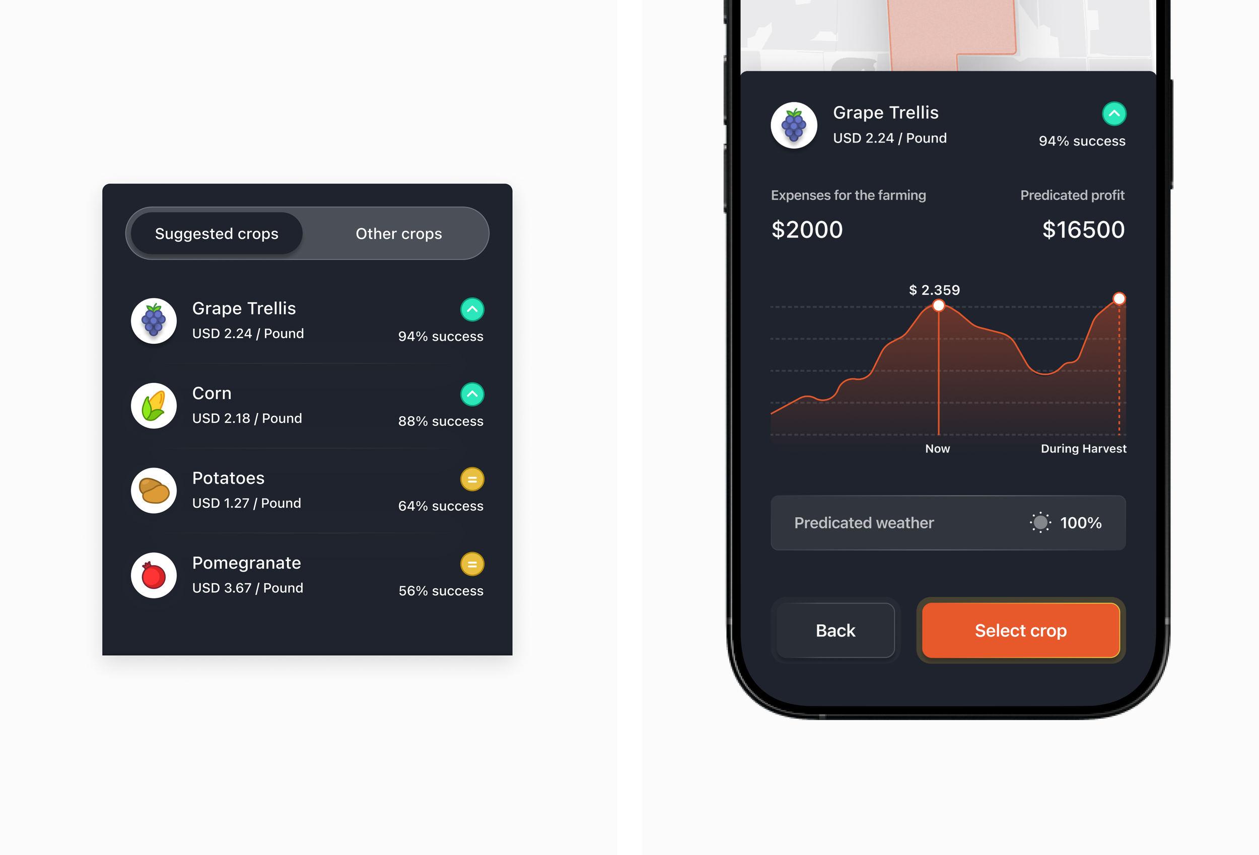
I made crop picking feel less like a gamble and more like a smart bet. Farmers get clear success rates, earnings per pound, and easy visuals — no spreadsheets needed. Once they tap a crop, they see what it’ll cost, what they’ll earn, and even a yield forecast. Quick, clean, and confidence-boosting.
03/05
“Buying seeds felt like shopping in the dark” 🛒
Most farmers had no idea what products were actually right for their land — and even if they did, buying them meant endless calls, middlemen, or store visits. I redesigned the purchase flow to feel like a curated shop for your farm: personalized product suggestions (based on your crop + field), transparent pricing, and one-tap ordering. Whether it's seeds, fertilizers, or smart sensors, farmers now browse with confidence — like Amazon, but tailored to soil and sunlight.
I wanted buying farm supplies to feel smooth, not stressful. So I added a quick planting method toggle and auto-suggested quantities based on farm size. The checkout is clean, clear, and skips the fluff — just the essentials, smart pricing, and one satisfying orange “Buy” button to seal the deal.

04/05
“I need a tractor... but just for 3 days” 🚜
Big machines, big costs — and no easy way to rent just what’s needed. Farmers either had to overpay or borrow from neighbors. I designed a simple equipment rental system where users can browse available tools, compare pricing, check nearby availability, and book directly from the app. Need a drone for one scan? A harvester for the weekend? Done. It’s like an Airbnb for agri-gear — just without the awkward small talk.
I wanted renting a tool to feel as easy as borrowing from a neighbor — so I added friendly farmer profiles, clear mileage info, and a big bold “Rent it” button. Once confirmed, users get a cheerful success screen and real-time pickup alerts. Simple, human, and just a tap away from getting the job done.

05/05
“So... how’s my farm doing, really?” 📊
Farmers were juggling notes, texts, and memory to track field health, expenses, and crop progress — with no single place to see it all. I built a central dashboard that brings everything together: crop status, soil moisture, budget spend, upcoming tasks, and weather alerts — all in one clean, scrollable view. It’s like a mission control center for your farm — minus the stress, plus some beautifully color-coded insights.
Farm finances got a modern makeover — with a colorful transaction tracker and real-time profit updates that actually make sense. The quirky “Convert your farm into IPO” CTA adds ambition and energy, turning every farmer into a potential founder. It’s finance with flair, designed to feel bold, simple, and empowering.

Conclusion 🌱
Farmacy was more than a design challenge — it was a chance to reimagine farming for the future. By blending data, design, and empathy, the project turned complex agricultural needs into simple, actionable tools. From crop choices to drone scans and financial insights, every screen was crafted to help farmers feel informed, in control, and inspired. The result? A platform that doesn’t just support farms — it helps them flourish.

Explore the full case study 👀
Dive into the full case study to see the pixels, process, and big-picture thinking behind Farmacy.